

Portfolio

Different practices.
Different ways to feel.

The same words shouldn’t work for everyone. Neither should the same website. Here’s what changed when I started with the practice instead of the design.

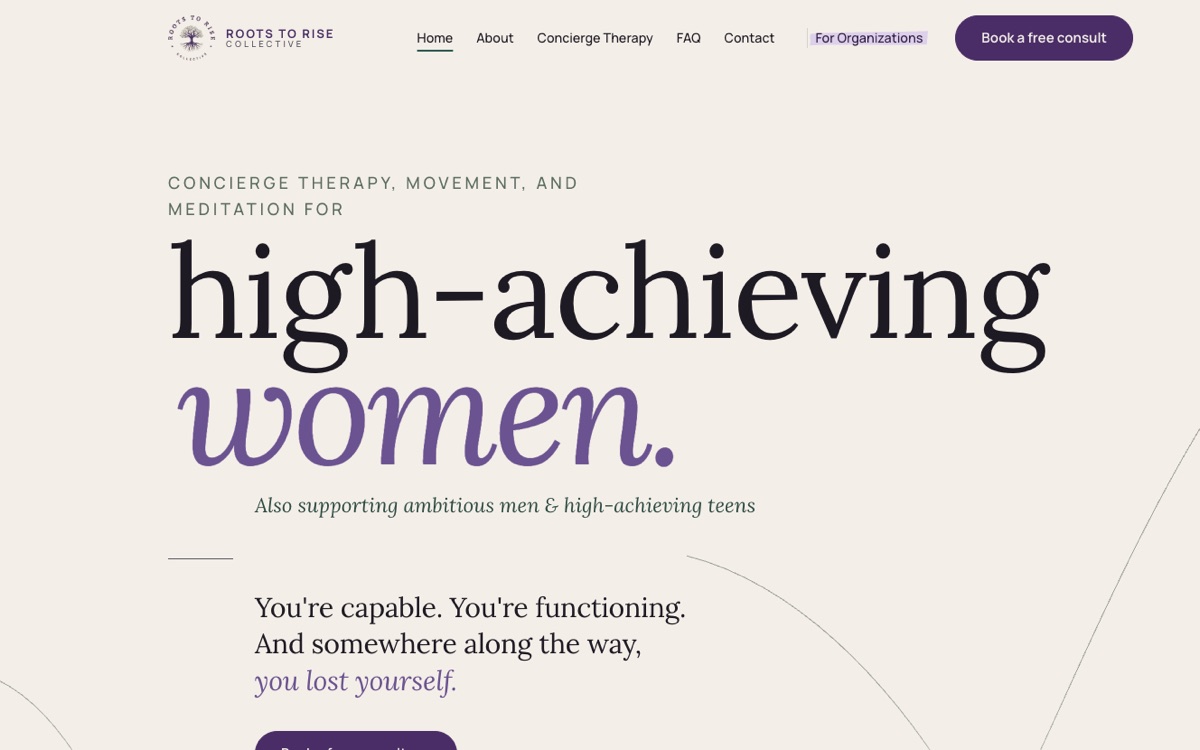
Roots to Rise Collective · Concierge therapy · Holly Springs, NC
01 · Client website

Roots to Rise CollectiveConcierge therapy · Holly Springs, NC

What I built
  • One clear message for three audiences.

    Women first, teens and organisations each with their own place, so no visitor has to sort through what isn’t for them.

  • Her words, edited, never replaced.

    Every page built from her own copy, tightened line by line with her approval.

  • A visual identity drawn from her logo.

    Colours, type and photography direction that feel calm, warm and premium.

  • Booking and follow-up, connected.

    Free consult, client portal, a discovery call for organisations and a newsletter signup, all wired in.

  • Built to be found.

    Search-ready pages, mobile-first, accessible, and launched on her own domain.

View the website ↗
In her words

“She captured my vision perfectly.”

“Maria was fantastic to work with! She captured my vision perfectly and transformed it into a website I absolutely love. Her eye for detail, design instincts, and clear communication made the entire process seamless. She genuinely cares about bringing your exact vision to life. Highly recommend her work!”
Stephanie GarrisonTherapist · Roots to Rise Collective
María Alejandra Flores · Online psychotherapy
02 · Bilingual website

María Alejandra FloresOnline psychotherapy

What I built
  • Visual identity shaped around the way I work
  • Copy written from my own voice and therapeutic approach
  • Complete website in Spanish and English
  • Online booking and payments
  • WhatsApp and direct contact
  • Mobile adaptation and launch
View my psychotherapy website ↗
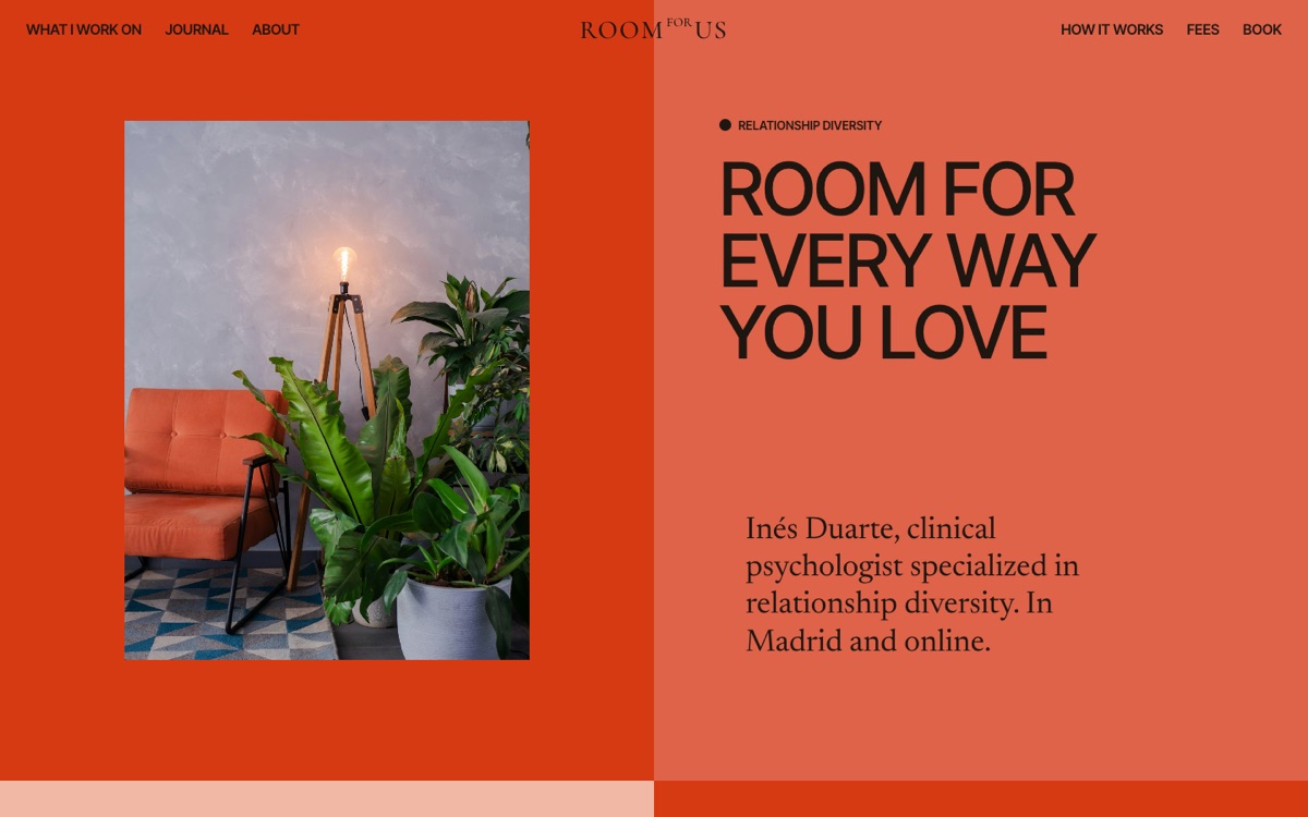
Relationship diversity
03 · Design concept · Relationship diversity

Room for Us

The starting point
Relationship therapy without treating one relationship model as the default.
The words
I didn’t write “couples” as the default. I wrote “However you do love.”
The design
Bold colour and images where the relationship isn’t explained for you, so no one has to wonder whether they’re the “right” kind of couple.
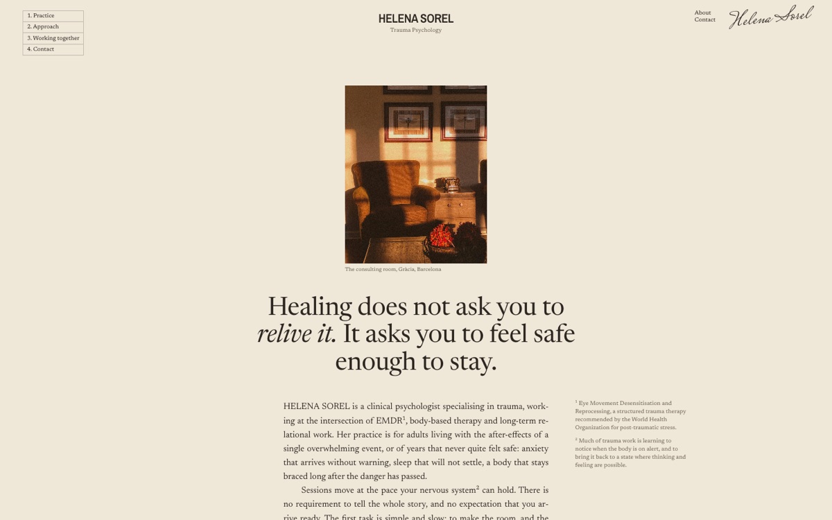
Trauma psychologist
04 · Design concept · Trauma psychology

Helena Sorel

The starting point
Someone looking for trauma therapy may already feel on alert.
The words
Instead of promising “a safe space”, the site lowers the pressure: “There is no requirement to tell the whole story.”
The design
Warm paper, dark ink, slower pacing. Nothing that rushes the reader.
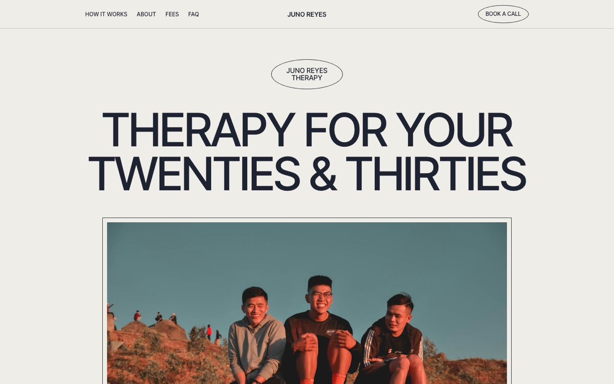
Therapy for your 20s & 30s
05 · Design concept · Twenties & thirties
The starting point
“Young adults” is a demographic. It doesn’t say what being in your twenties or thirties actually feels like.
The words
“Am I behind?” “What if I choose wrong?” “I thought I’d feel more sure by now.”
The design
Big type and short lines feel like their world, not a waiting room. Nothing to wade through before finding what it costs or how to start.
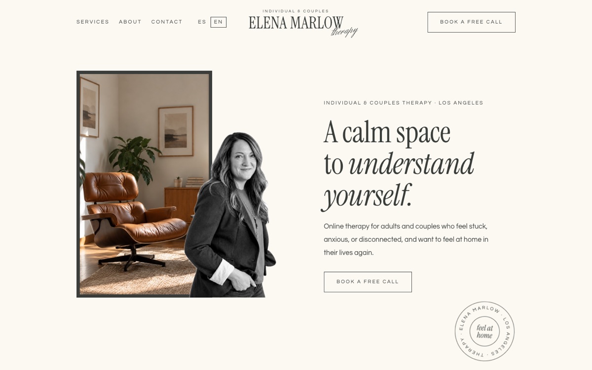
Individual & couples therapist
06 · Design concept · Individual & couples therapy
The starting point
Many of her clients aren’t in crisis. They feel stuck, and wonder whether that’s enough to start.
The words
“You don’t need a diagnosis or a crisis to start.” And couples described the way they’d describe themselves: “the same argument”, “more like roommates”.
The design
Warm neutrals and layered photographs make the site feel lived-in, closer to a home than a clinic.
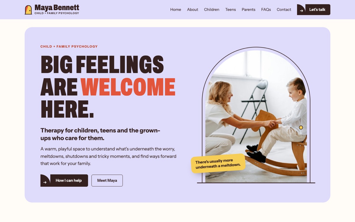
Child & family psychologist
07 · Design concept · Child & family psychology

Maya Bennett

The starting point
Parents often arrive with a behaviour they want to change.
The words
“Big feelings are welcome here.” “The behaviour you see is only part of the story.”
The design
Bold colour and playful forms make that idea feel approachable, not clinical. Separate paths give children, teens and parents their own way in.
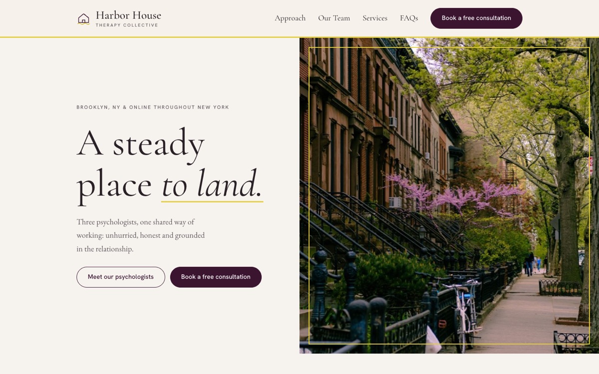
Therapy collective, team of three
08 · Design concept · Therapy collective

Harbor House

The starting point
A group practice can easily feel anonymous. But therapy is personal, and people want to know who they’ll actually be sitting across from.
The words
“A small practice on purpose.” “We match you with care, not just availability.”
The design
A quiet, residential visual world makes the collective feel established without becoming institutional. Individual profiles keep each psychologist visible within one shared practice.
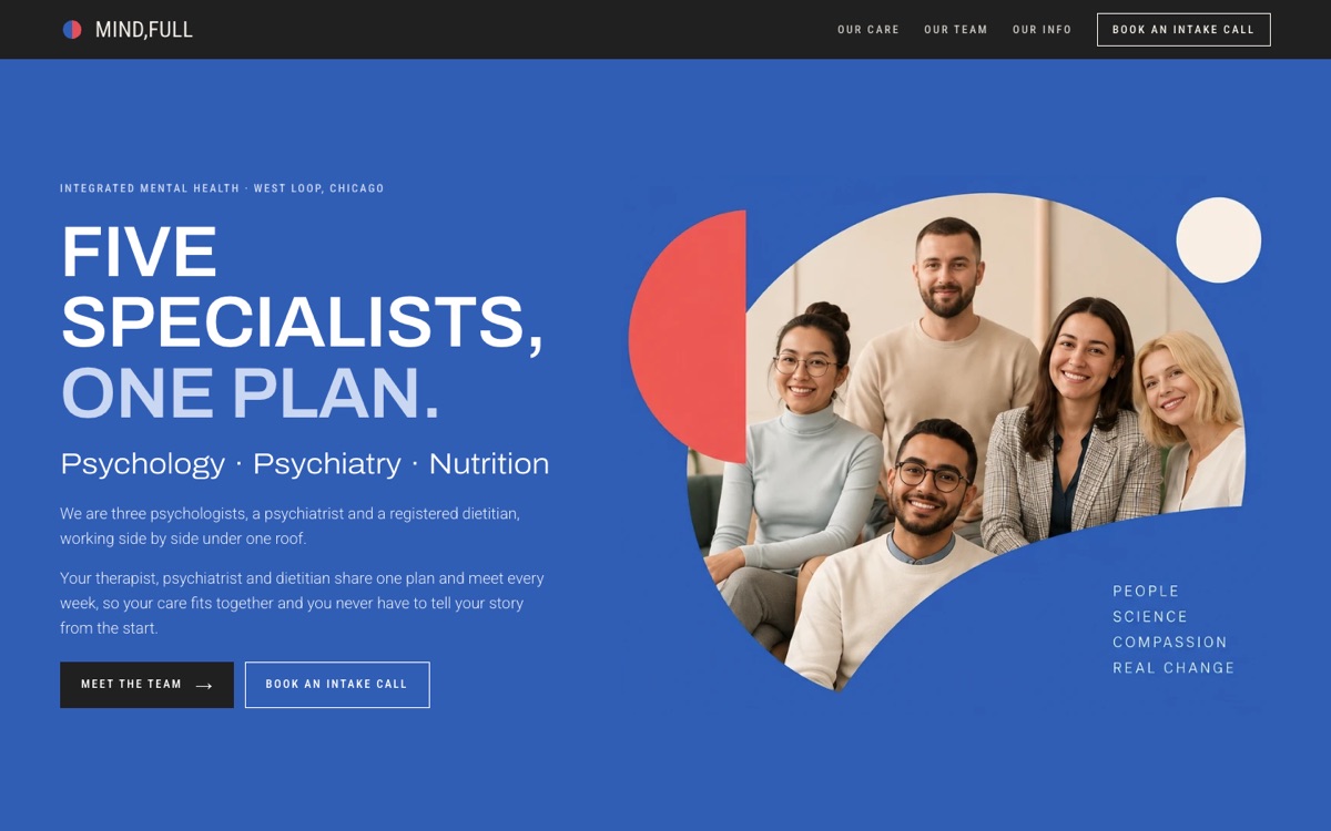
Multidisciplinary centre: therapy, psychiatry, nutrition
09 · Design concept · Multidisciplinary centre
The starting point
Different specialists can mean fragmented care, and telling your story again and again.
The words
“Five specialists, one plan.” “One plan, not three appointments.”
The design
Distinct colours separate each discipline, then bring them back into one system. Complex care becomes easy to understand at a glance.
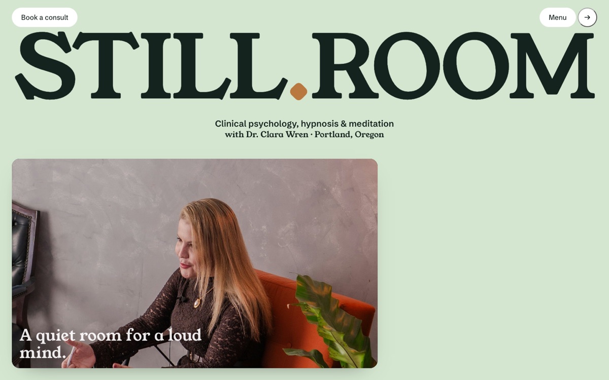
Clinical psychologist: hypnosis & meditation
10 · Design concept · Hypnosis & meditation
The starting point
Hypnosis can feel mysterious, theatrical or even a little unsettling. Before someone can consider it, they need to understand what it actually is.
The words
“A quiet room for a loud mind.” “Your mind is not broken. It’s tired.” The language makes hypnosis feel ordinary before asking anyone to trust it.
The design
The site slows things down too. Soft greens, oversized type and plenty of space create a quieter pace. Myths become interactive facts, a hypnosis session is made visible step by step, and visitors can try a one-minute practice before they ever book.